Aon
RETIREE HEALTH EXCHANGE// WEBSITE REDESIGN
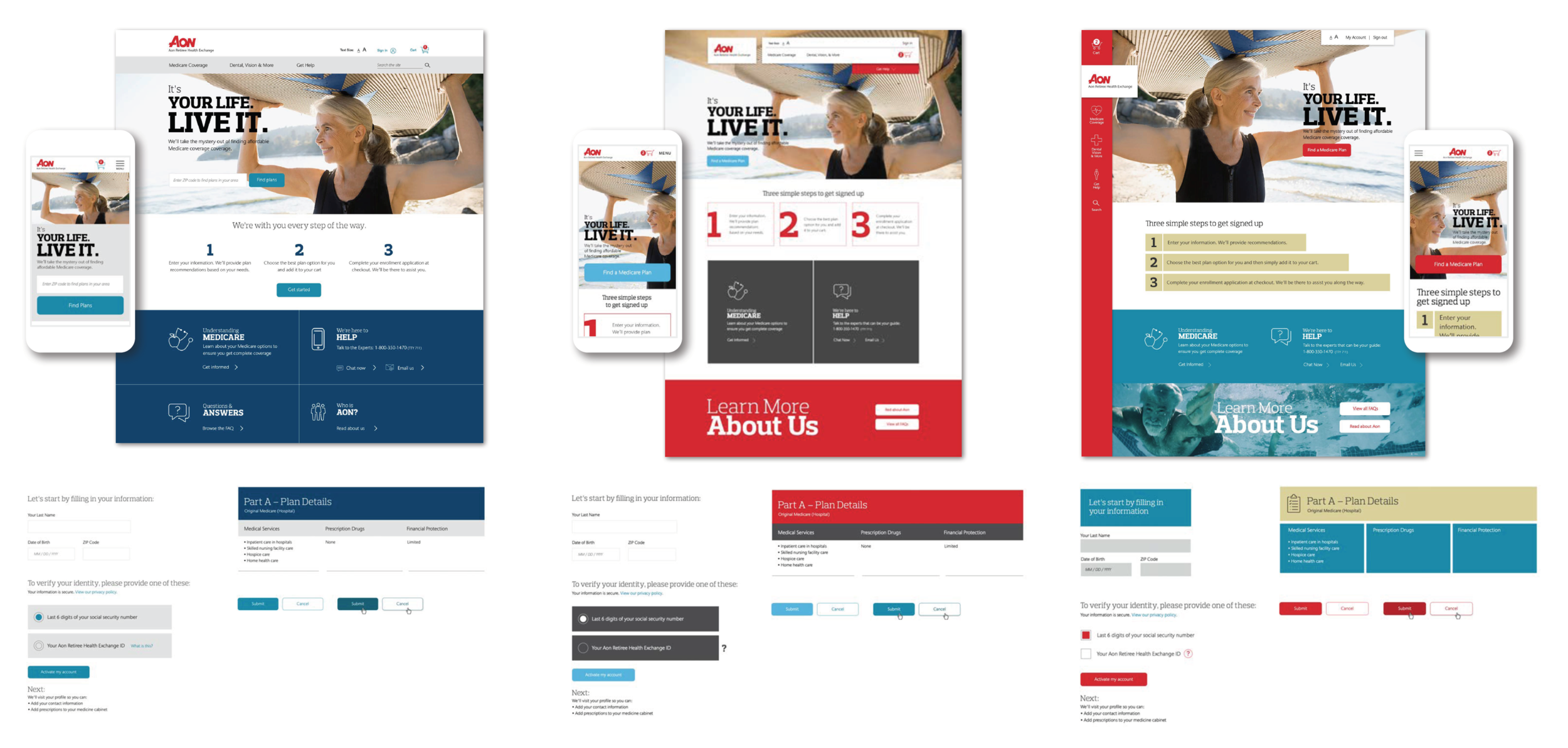
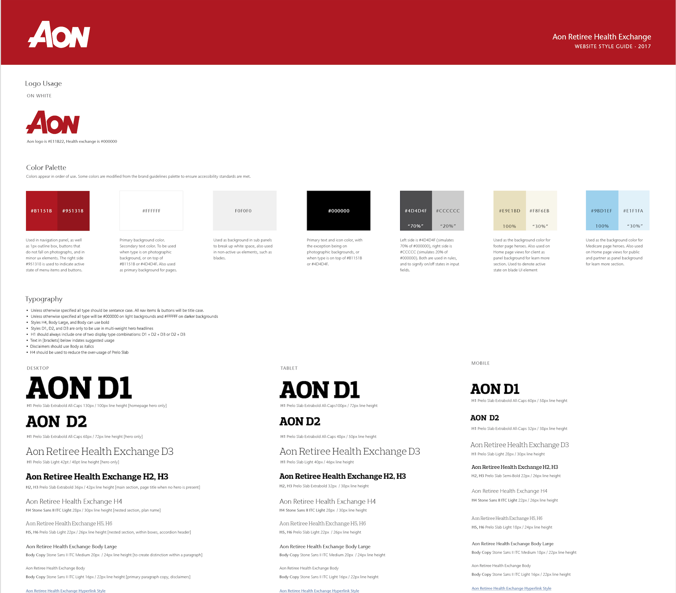
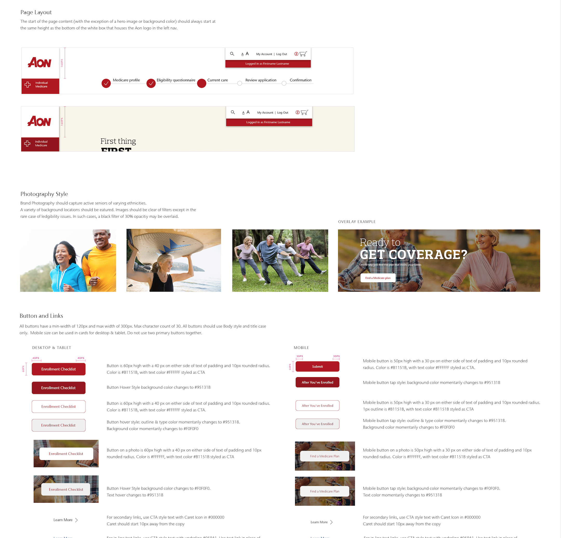
Take a task-focused website for the 55+ community that’s heavy with text and complicated information and make it feel like a friendly, light in weight, and easy-to-navigate experience. Ultimately we wanted users to feel relaxed when starting the process then stress-free and confident when finishing the process. Aon actually has strong branding, but it wasn’t being used on this particular website of theirs and their extensive brand guidelines didn’t offer much detail around designing for their digital properties.
PURPOSE
Simplify and modernize
Help users sign up for supplemental Medicaid with ease
Define the digital product brand guidelines for Aon
solution
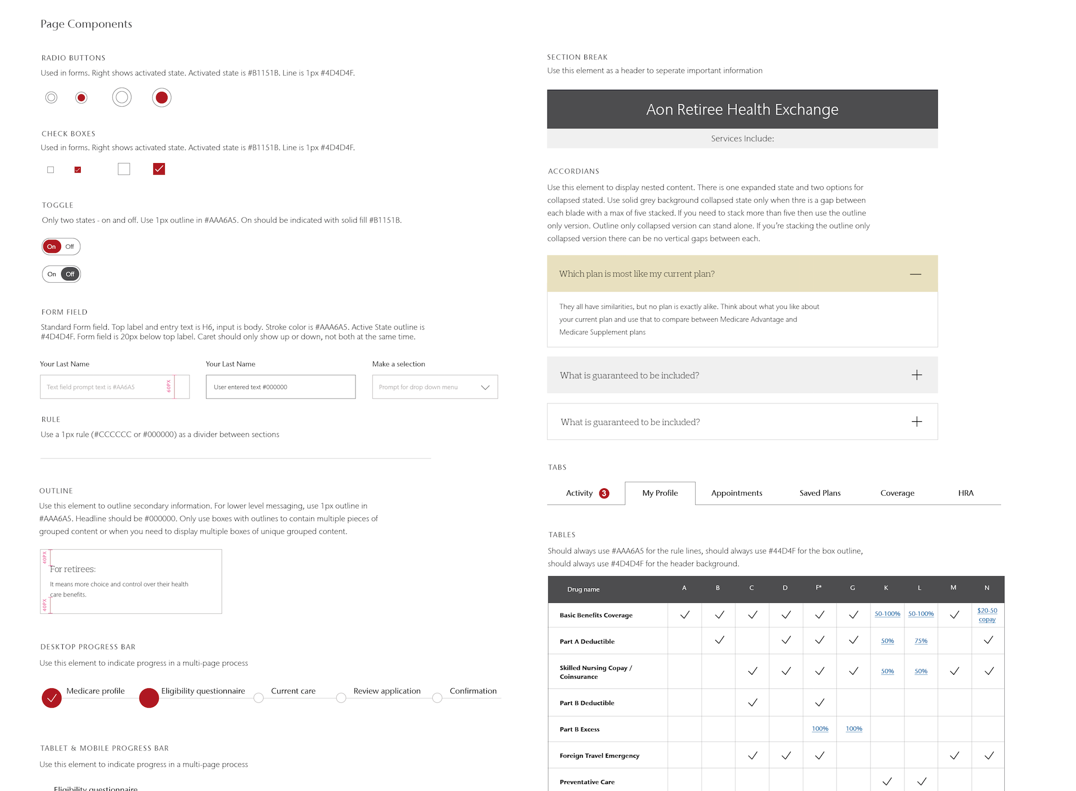
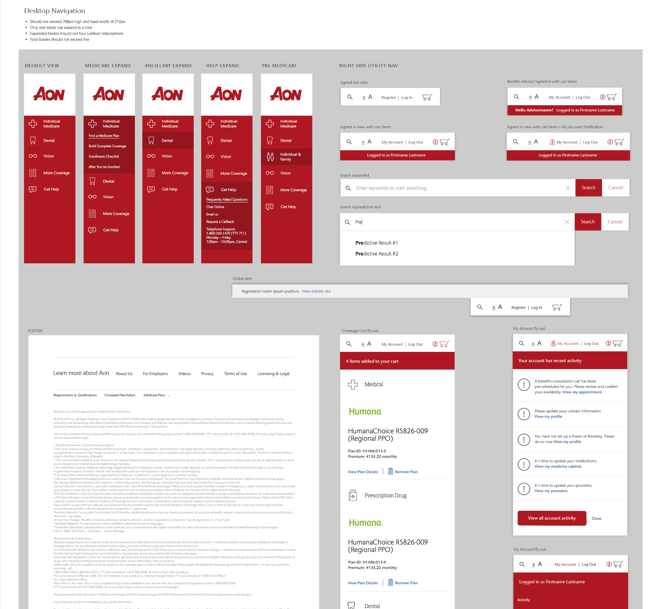
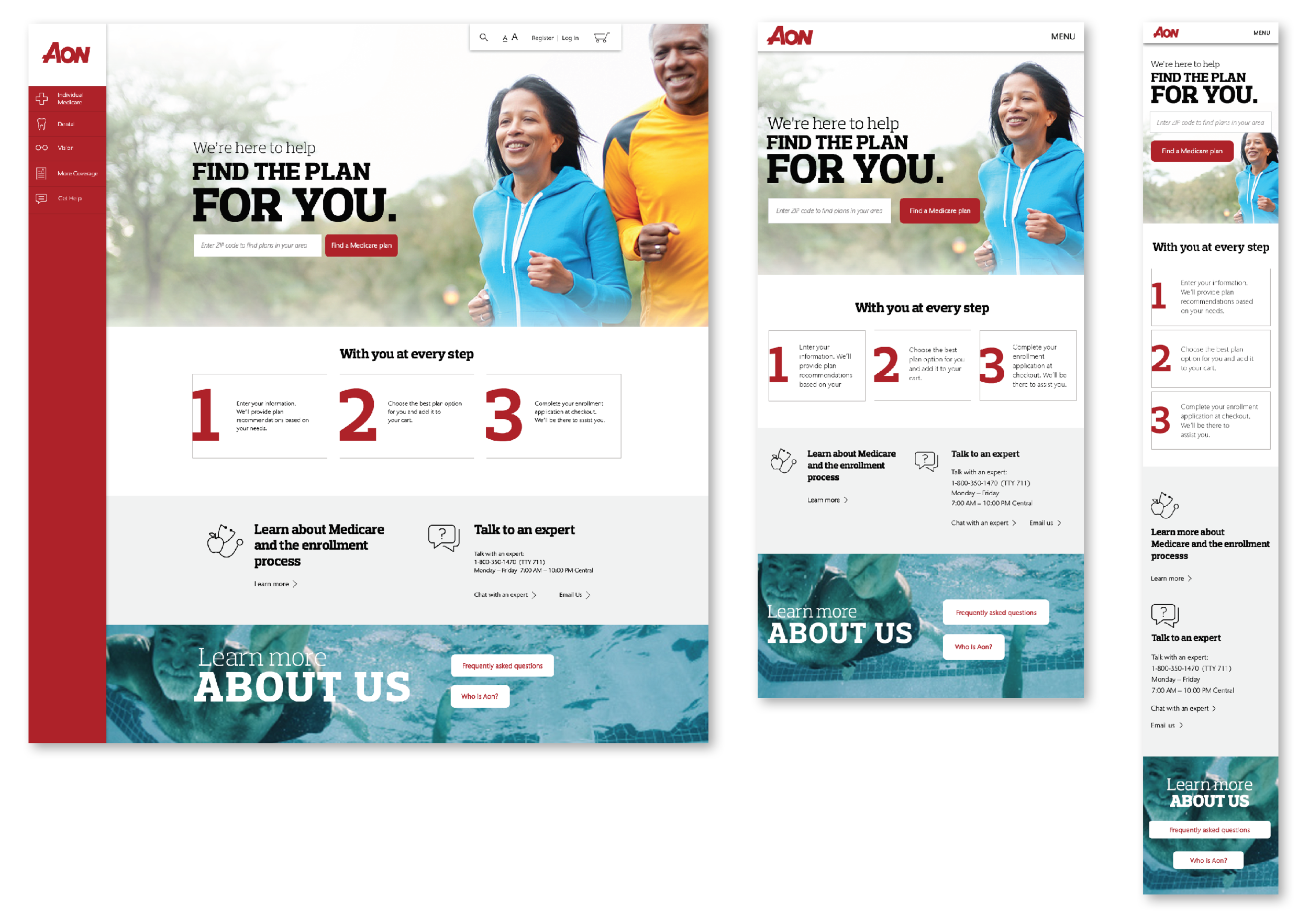
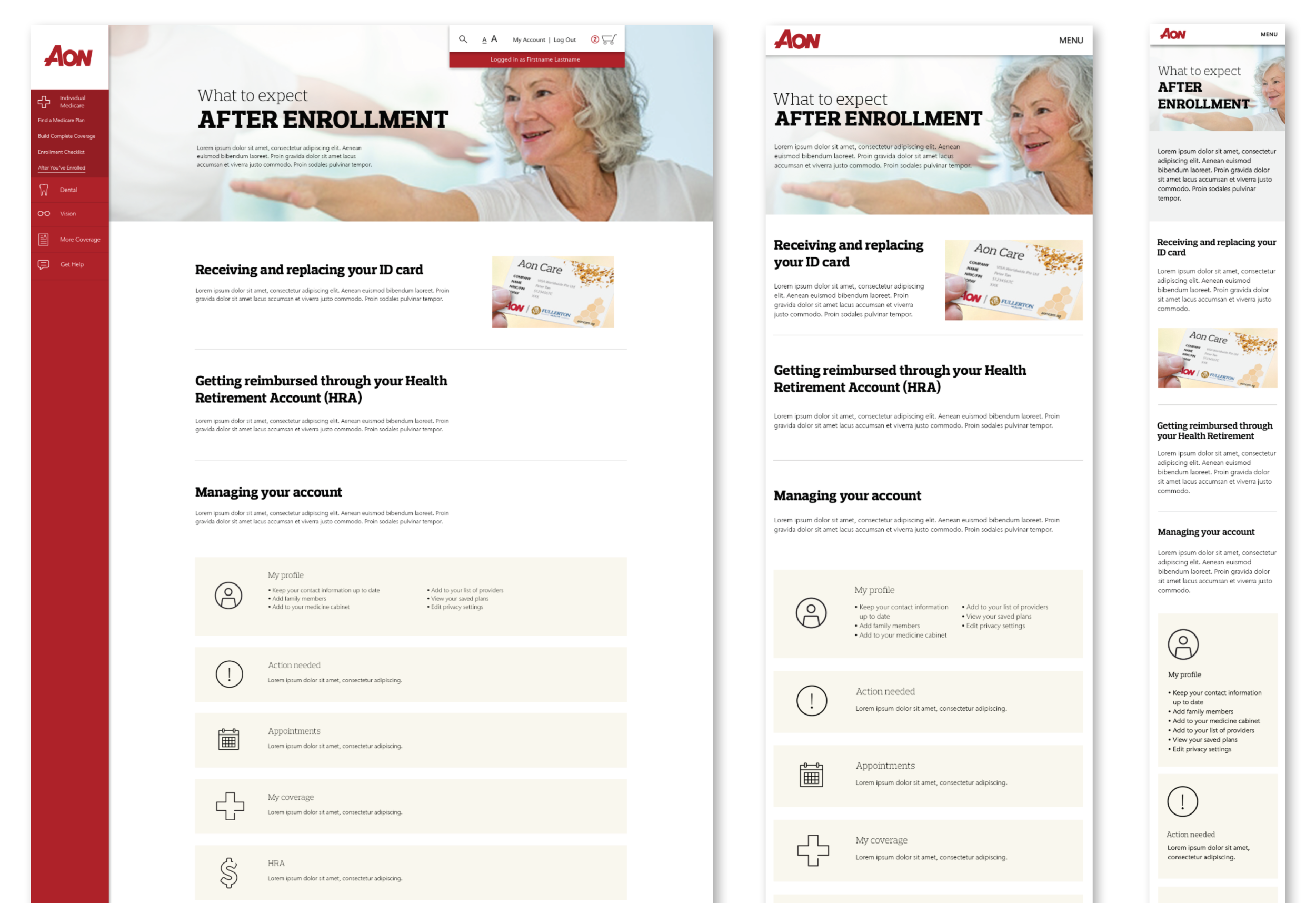
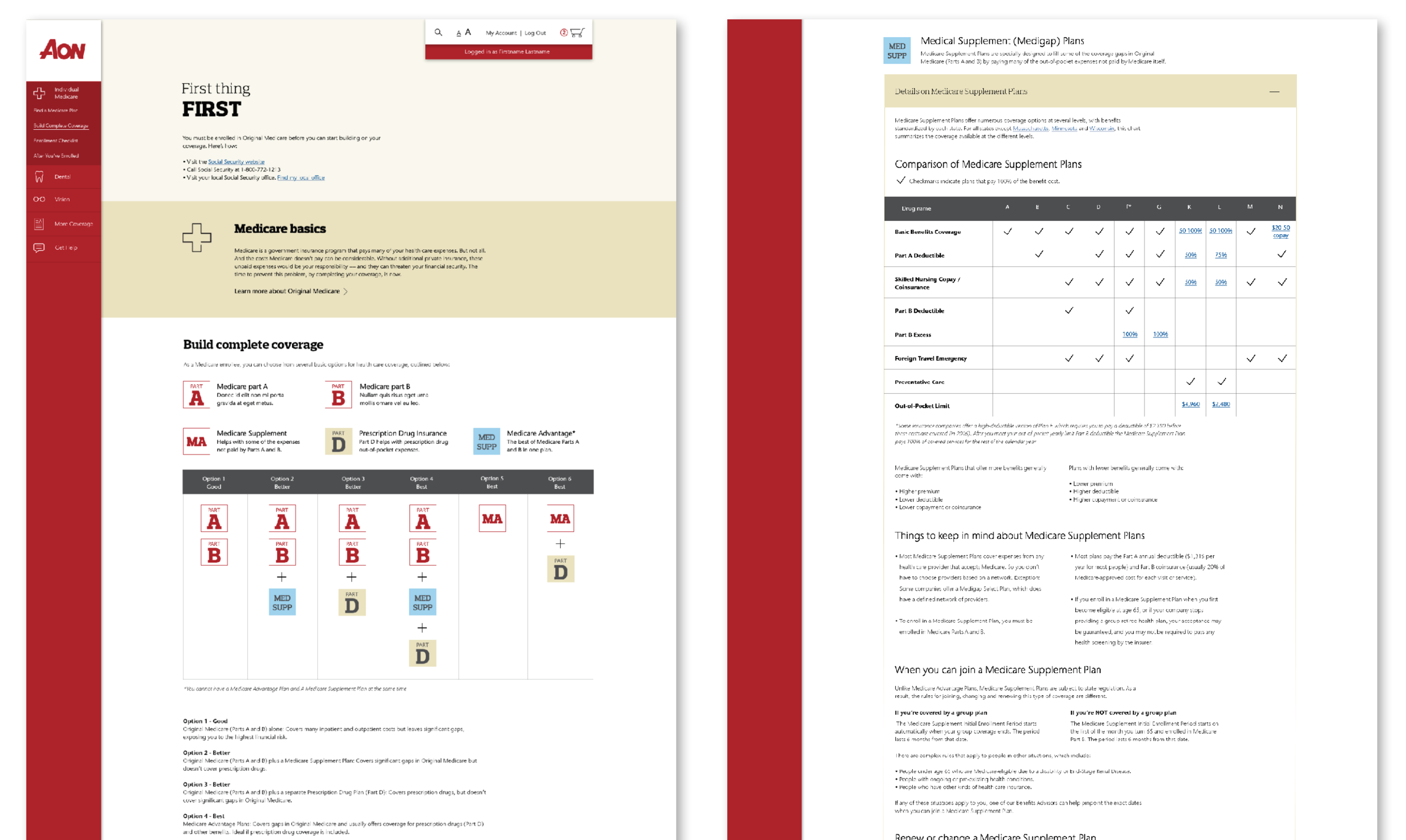
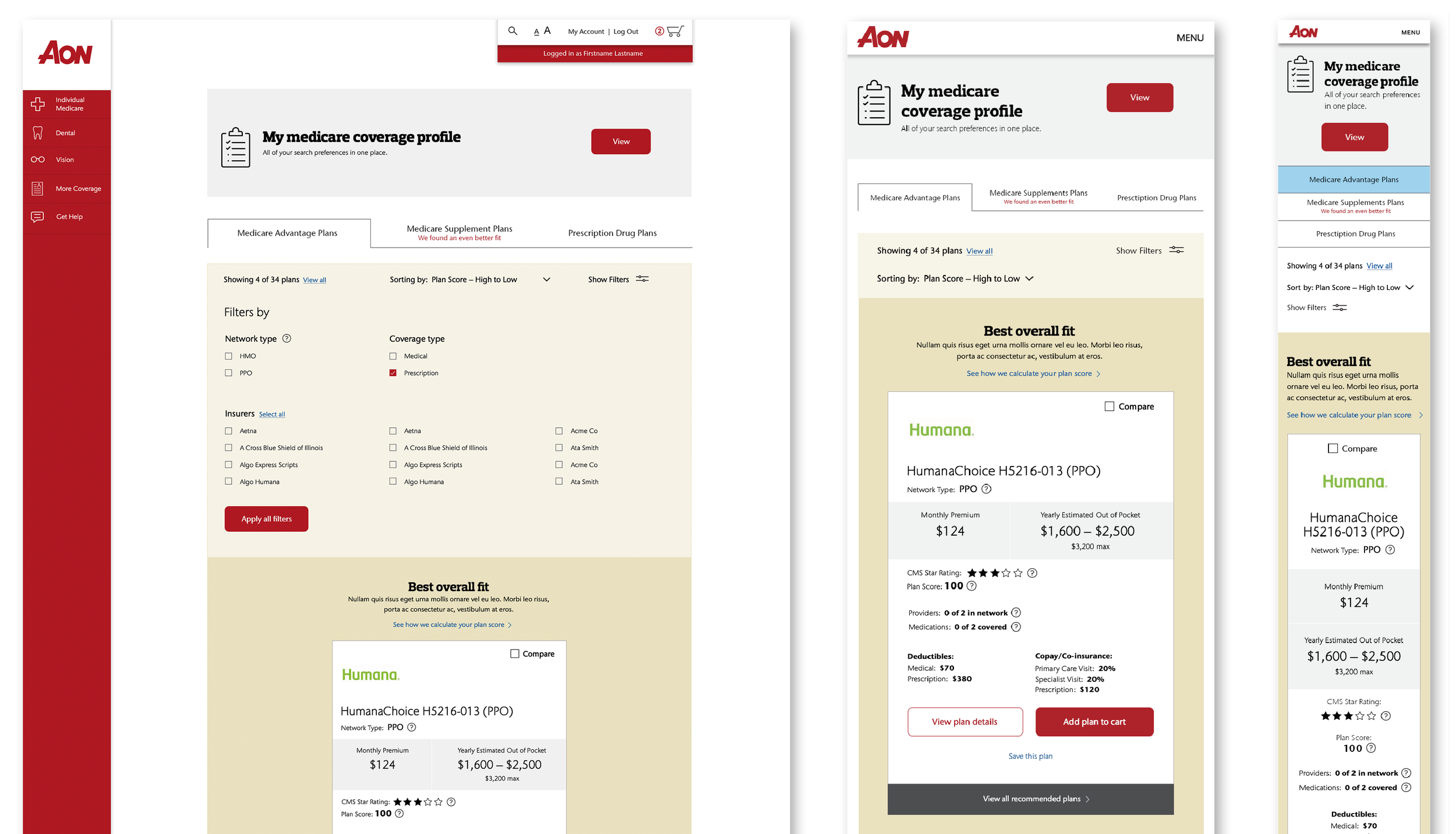
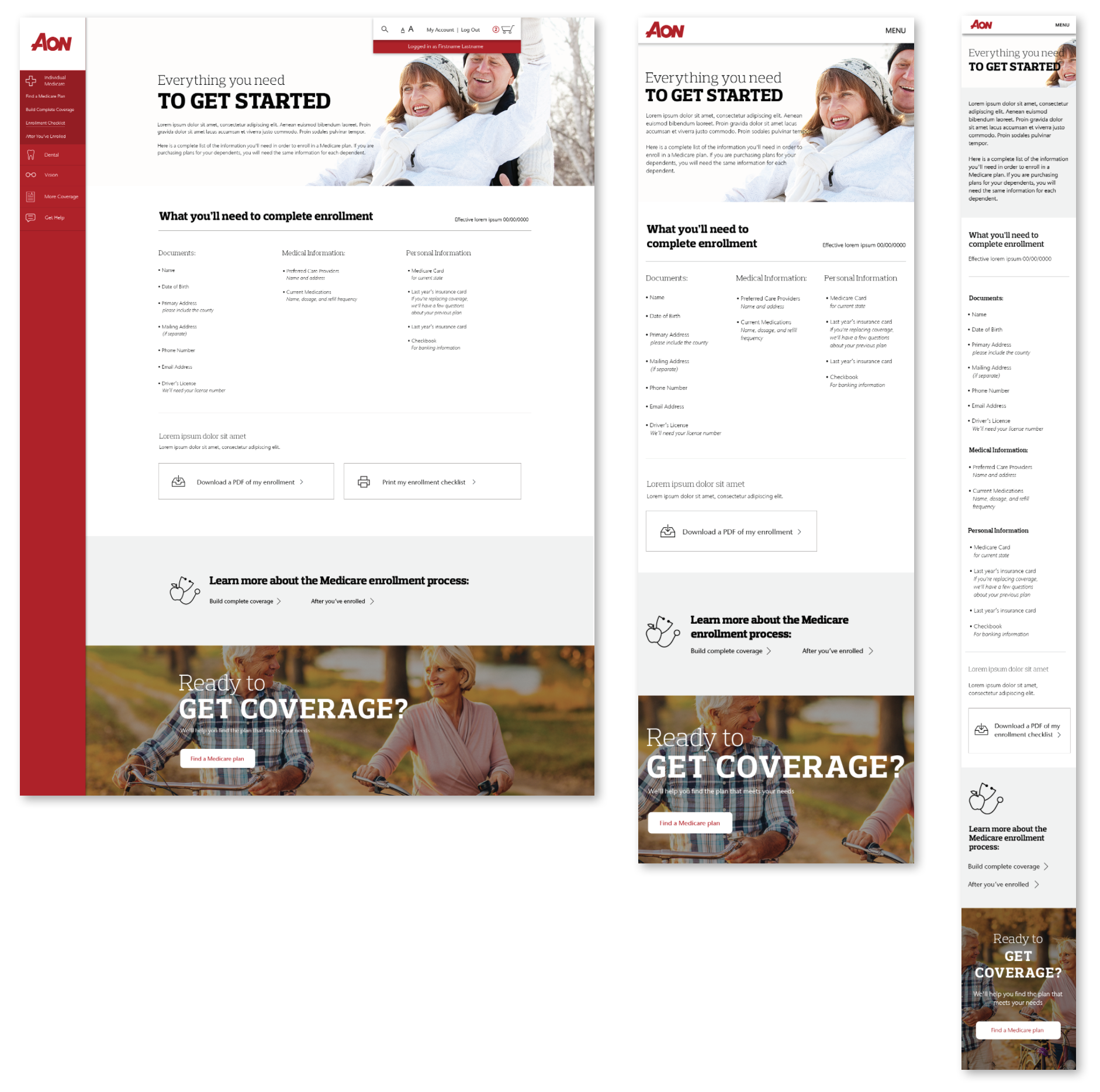
Our first solution was to create new standards/guidelines for how to design digital experiences on brand and add some personality to this particular site by defining a strong color pallet and bringing in big, bold photography and text. The next important solution was to reinvent their navigation by offering a persistent and simplified experience that was easy to locate at all times. It was also important to have a smart approach to the use of color to help break up the text-heavy pages in a way that enhanced the usability of the site and made the dry content feel more compartmentalized and digestible. This was accomplished through a strong color pallet and strategic placement of color blocks to help define unique spaces. Finally, it was vital to make the site responsive. Even though the majority of the tasks on the site would be completed on a desktop experience, the research found the lack of a mobile-friendly experience diminished the confidence of users in the discoverability phase of the user journey which caused users to have an unfavorable feeling about the overall site experience before they had even begun the sign-up process on their desktop.
outcome
While the entire site redesign is completed from a UX and UI perspective – due to budget and build capabilities for Aon, their team decided on a phased launch. They have currently launched the home page and part of the updated main navigation. The next phase will be the individual page redesigns and then the mobile experience. Although the full site has not launched, our usability testing with a full-fidelity prototype yielded outstanding results in all the areas we were targeting.